Redesigning is overrated. It can seem like a quick and easy way to get rid of all of your problems, but it rarely is. Here at Froont we helped hundreds of different organizations and businesses create a new website, and being a startup ourselves this is what we learned.
Problem first, redesign later
Or as Hans Solo put it, “Escape now, hug later.” Redesigning is like hugging. It feels good, but you might die if you don't get your priorities straight. All design should have a clear goal or a problem to solve first. If your website was made 10 years ago, then looking outdated could be a valid problem. If your conversion rate is at its all time lowest, that is a valid problem too. Here are five examples that should lead you to seriously consider building a new website:
1. The current design isn't flexible enough
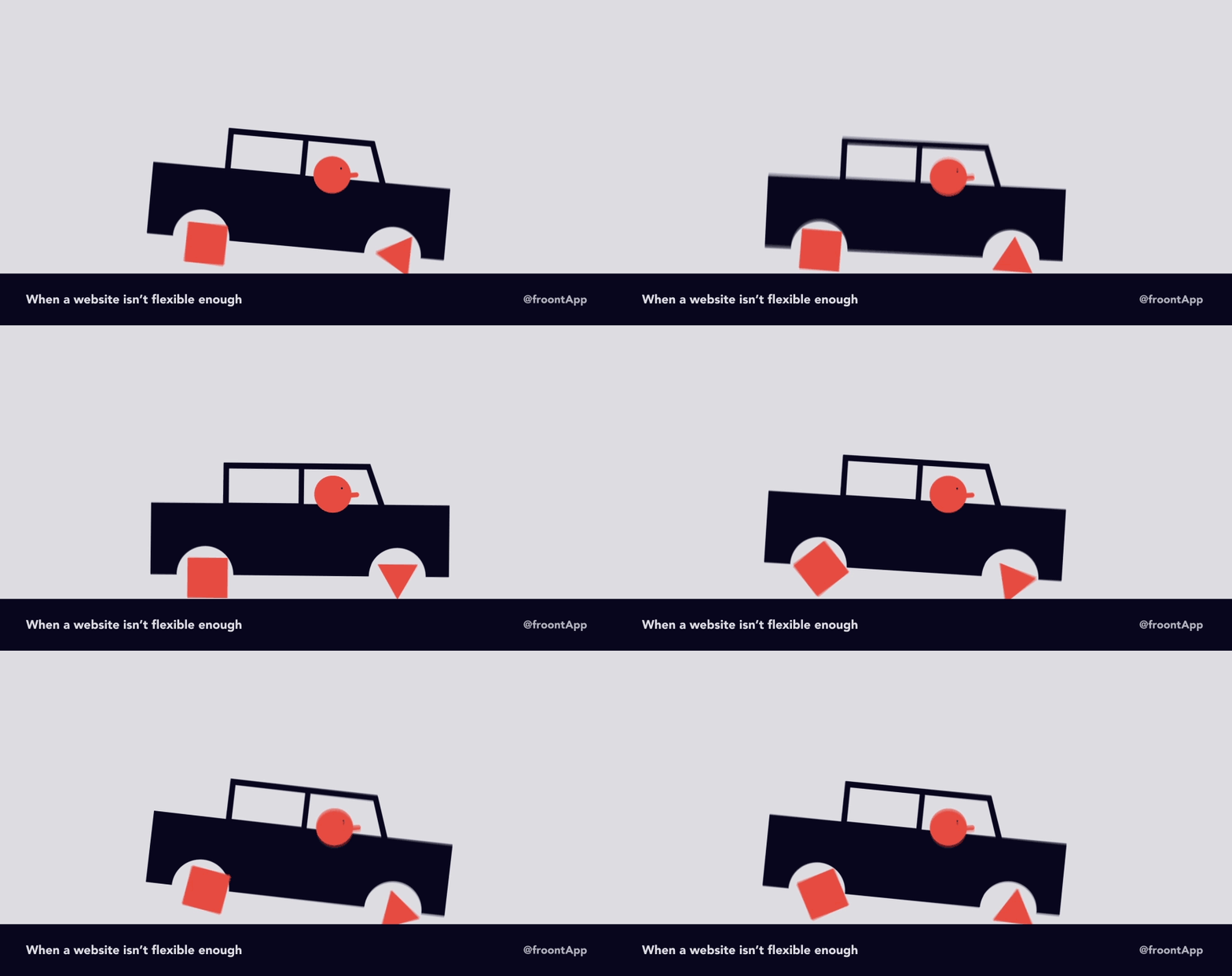
This is a big one and it's often misinterpreted. It's important that design is there to help move forward quicker rather than get in the way. Good design speeds up decision making, gives space for experiments, is easy to maintain and update. Good design is flexible but has a set of rules and limitations. The technology and visual side work together, not against each other. If you have to set up a meeting for each new section, you're doing it wrong.
Avoid thinking purely about design features,instead spend time thinking about systems. Modular UI systems is one of the approaches that will solve this issue. Create a system where a designer can change the color of a button and a developer can design a new page.
2. The web changed before you did
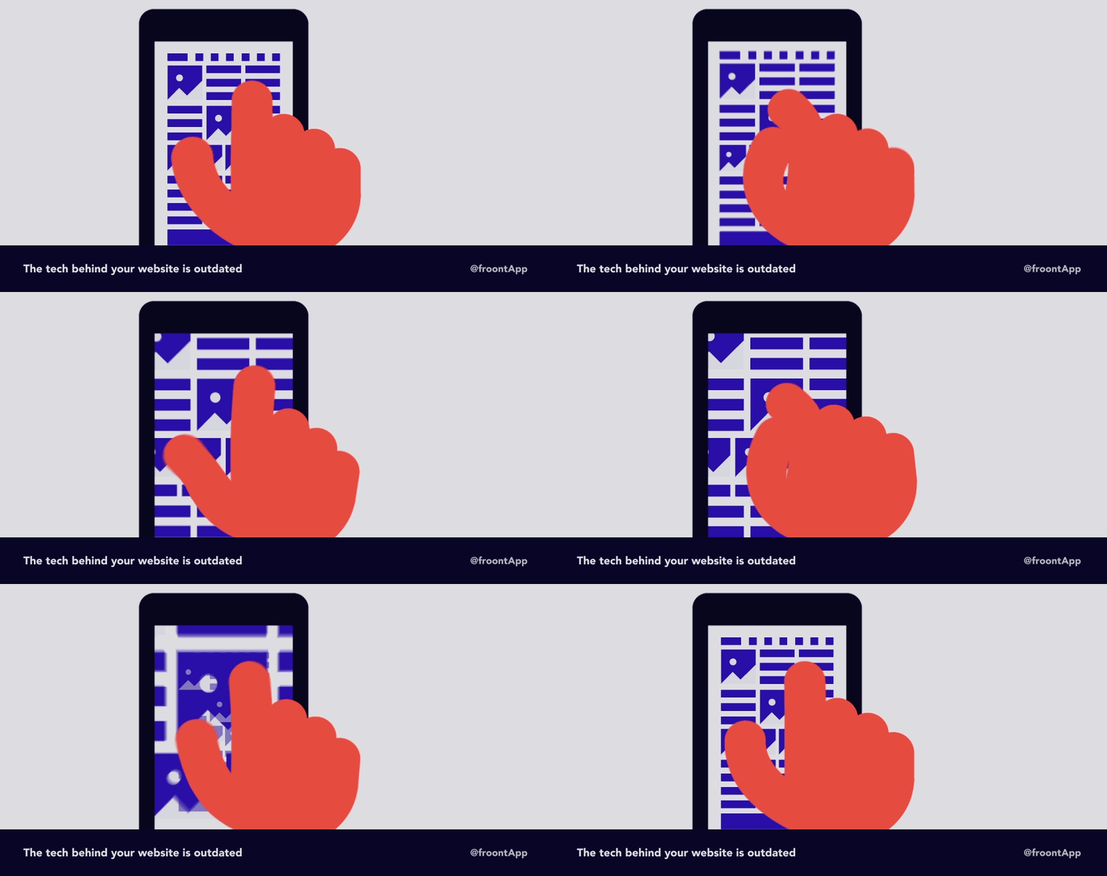
So you missed that responsive web design thing, thinking it was soon to fade away buzzword. Change happens, sometimes very quickly. We all make mistakes and a redesign is a great opportunity to improve much more than just the visual side of things. So, when do you pay attention to trends? Here’s a checklist for that:
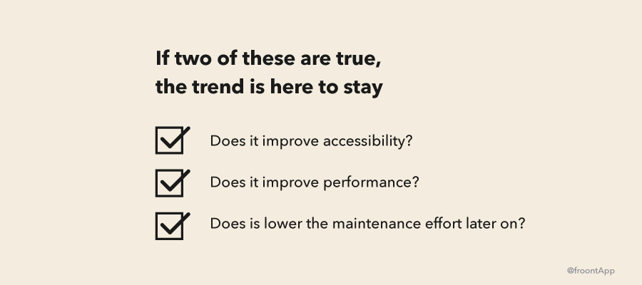
By improving loading speeds and making the page accessible on your visitor’s devices, you not only improve your conversions, but you’ll also rank higher on search engines. Google’s ranking algorithm rewards mobile friendly pages and soon loading speeds for mobile pages will influence your ranks as well.
3. Your product or service has changed
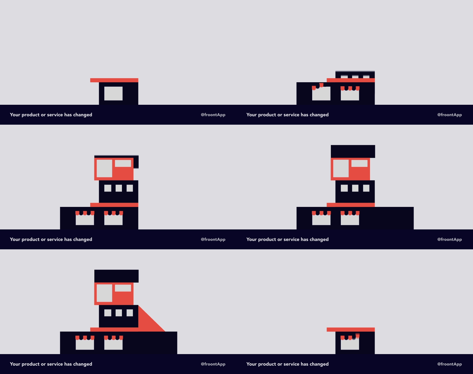
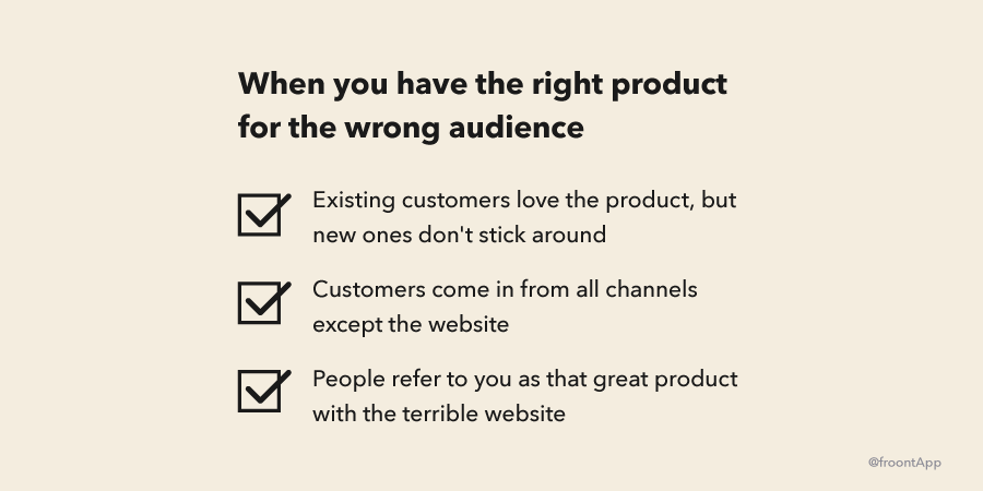
A major version update, a big pivot, a new headline product – all of this might be asking for a new design. It's also possible that your biggest change is simply your marketing message. For instance, you change the focus of your product from B2C to B2B. Simply put, make sure the tone and look of your website send the same message as your product and marketing does. Otherwise you can end up with the wrong audience for the right product.
4. You haven't updated in ages
This happens. You get busy building and selling your product and when you turn around, a few years have passed. It's totally fine to tell your audience that you're still alive and kicking. Following or even setting trends in this case is a great way to send the message to your audience that you care about them and about the quality of your service.
5. Be better than your competitors

There are times when you can benefit from standing out and there are times when you’re better off blending in. When you are just starting, following the market leaders can send a message that you are serious about your business. Visitors will be used to the patterns and design you're using.
Then again, standing out sends a message that you are different. There is no formula here. When Dropbox started, file sharing was ugly and cumbersome They went the opposite direction by standing out with simplicity in the design and the product. If you're building a similar product now, standing out with an archaic interface wouldn't be a good idea. Instead look for ways build upon what’s been set and improve it.
Design can set you apart from your competition, but blending in,in terms of simplicity, using patterns people are used to is always a good idea. Keep in mind that if you're doing a good job with your product or service, others will follow you.
When redesign isn't the solution:
“A friend of mine doesn't like it!” Opinions suck, as long as this “friend” isn't a customer of yours. For every “friendly opinion” you should consult with 9 customers. We wrote a full blog post on getting insight with interviews.
Website performs great, let's change something? Just say “No.”
Your website feels outdated to you. It's very unlikely that others have seen your page as much as you have. It's natural to get used to what you have and lose the initial sparkle . If you're lucky enough and most of your users visit everyday, then your site is most probably performing just fine as it is.
A competitor launched a new website. Instead of blindly following competitors or design trends, it makes sense to look deeper – what are the reasons for that redesign? What problem are they solving? Do you even have the same problem?
A new design will make people talk about my company. This could work. Look at Airbnb or Instagram – people do talk about this kind of news. Especially when the product has millions of users. Or the product is meant for designers. If neither is true for you, maybe start by improving the product, marketing and sales and get that growth in place.
Conclusion
Be prepared. Whatever the reason for redesigning your website, keep in mind to allocate enough resources. A redesign will take time to define the problem, come up with solutions, make the decision and measure the results, make conclusions and fix the mistakes. If you haven't made a mistake, you haven't been looking deep and hard enough. Including management in the redesign process is also a great idea and if you’ve never done it, it's worth following a framework. Design sprints from designers at GV is a great place to start.
