One of the great benefits of digital design is that it can be tested and measured. Yet so many aren’t doing that. Partly we can blame the workflow, where the client buys the design from the designer and focuses on aesthetics, not the results. But what if that could be included into our deliverables? What if we provided the designs and helped improve them? I admit it's scary, since the new design might perform worse that the previous one. Then again, what if we improved the design based on the data we gathered and ended up doubling or tripling the conversions? The gains seem to be way bigger than the scars to your ego.
To test or not to test
Although testing is a powerful tool used by pros, there is no reason why you shouldn’t test simpler sites even if it's a portfolio or a marketing landing page. The more abstract and high level the design the more value you get from your tests. If you use simple rough wireframes, the focus is on the product and its values rather than details and visuals.
There are three main types of testing:
- Testing the IF. Is there an interest for your yet non-existing product or feature? Are people interested in the feature? Will people buy it? It is way more efficient to start testing before building the product.
- Redesigning an existing page or a part of it, like revamping a landing page design or testing a new price. Colors and micro interactions don't usually need much testing at the beginning, they need a smart designer!
- Optimizing an existing product or page. Can be applied to the visual design or the whole user flow funnel. Big impact can be achieved by changing the placement in the funnel, for instance, by showing registration form after visitors have actually tried the product.
Misconceptions of testing
Testing can give a lot of insights and data if done right, but also there are plenty of ways to screw it up. First of all, testing and gathering data is not a replacement for decision-making. An initial hypothesis will help a lot, otherwise you might drown in data. There are also situations where you are better off using your instincts.
Additionally, instead of approaching your average users, it's more interesting to talk to “extreme” users who really love or hate your product. Even though you are not designing for them, they emphasize the strong and weak aspects of your product more strongly.
A/B testing

A/B testing or split testing is something you hear most often. The concept here is simple – all your traffic is split into two equal parts where one sees design version A, and other sees version B. The version where the goal is accomplished more often is the winner (e.g., more users sign up).
A/B testing can be used at any stage and usually on bigger websites several tests run simultaneously all the time. It's great to test an idea to optimize what you already have built.
Heatmaps and scrollmaps

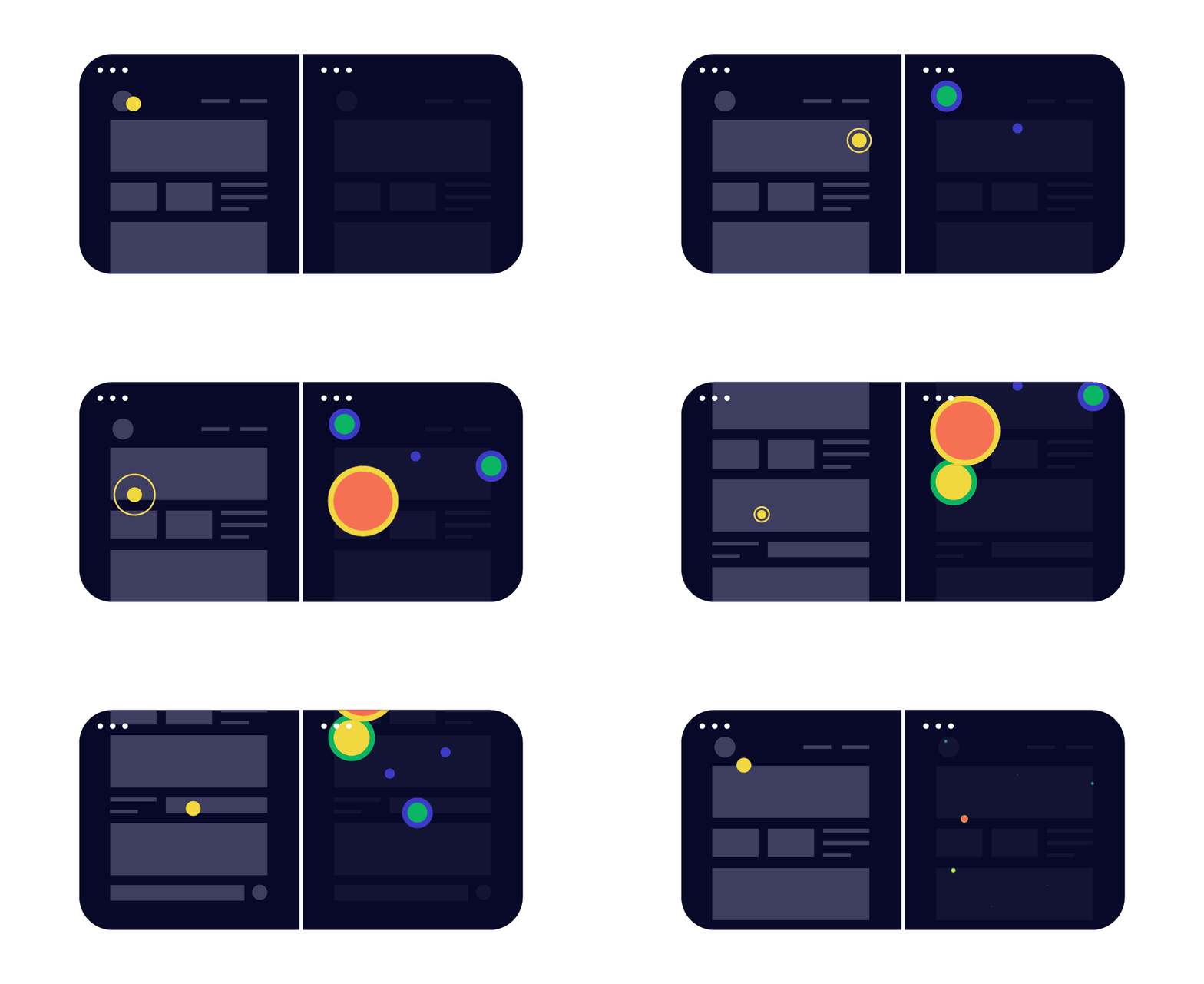
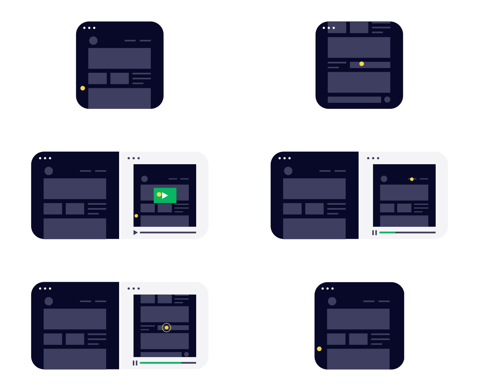
Heatmaps and clickmaps can show you where the users are clicking. It can help to understand which are the most prominent areas on your page and where an extra link can be added. It also makes sense to test how far users scroll and what are they're actually reading – this is where scrollmaps can help.
Heatmaps are great if you're testing an existing page and want to improve conversions. One thing to keep in mind – check if the service you're planning to use supports responsive web design.
User testing

One of the oldest techniques is to sit down with a person and learn how they're actually using your page or product. Set up some goals to achieve and watch if they get stuck somewhere. Great help can come from recording the session (we use ScreenFlow a lot, as it will record not only the screen, but also the expression and voice of the user). Another trick is to use tools that record sessions secretly, like Inspectlet. No matter what you use, having video recordings will help when you're having discussions with your team or the client.
Another great process comes from the guys at Google Ventures. They took it to the next level and are calling it a Design Sprint. The sprint is a five-day process for answering critical business questions through design, prototyping, and testing ideas with customers
Great for strategical decisions, helps create a hypothesis for improvements.
Surveys

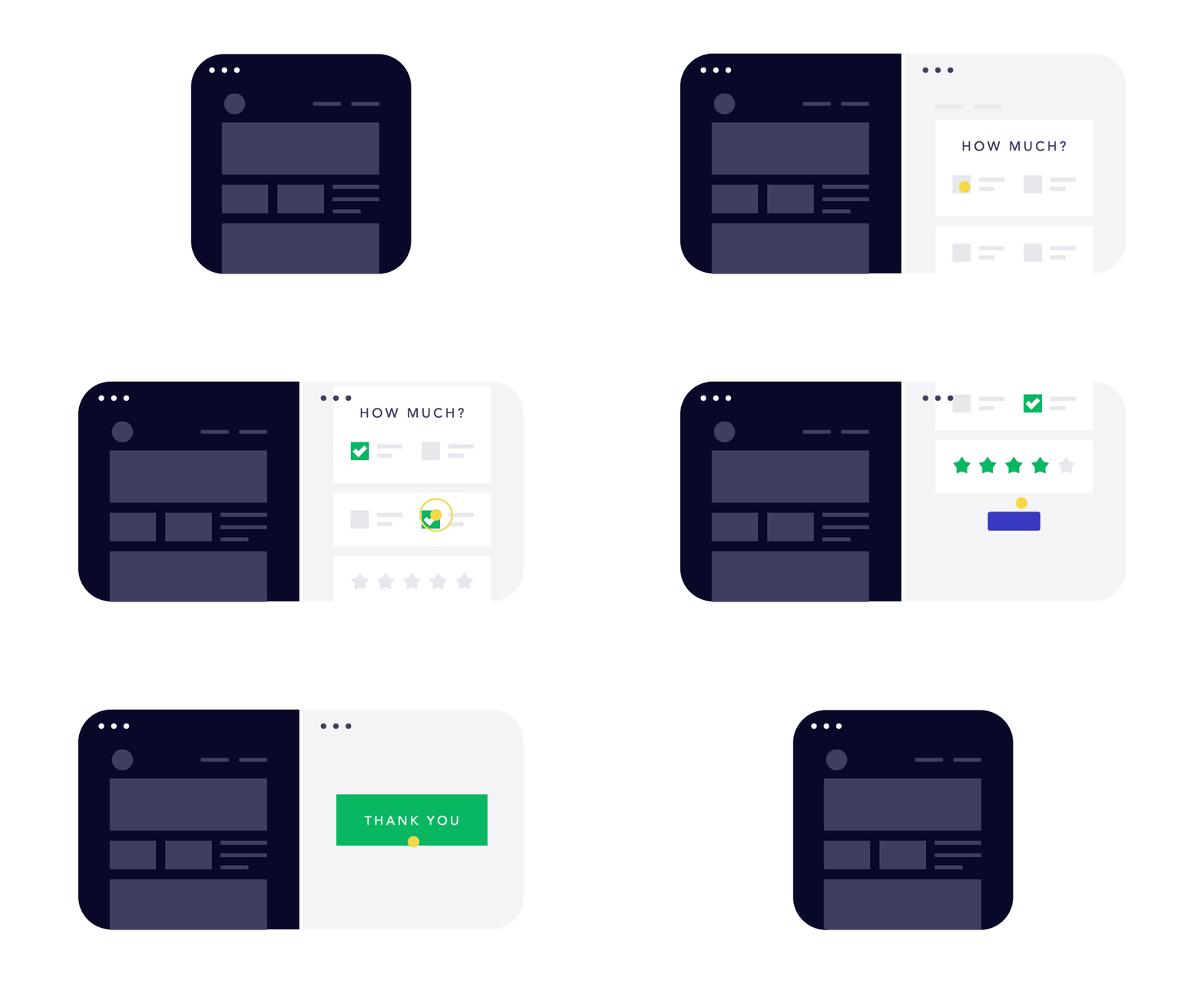
Another great and simple technique is to send out surveys. There are plenty of tools out there but in most cases Google Docs will work just great. The most important part are the questions and to take in account the size of your audience. The bigger the audience and more precise the questions, the smaller the chance to be biased by your own assumptions. A simple starting point can be to measure your users' net promoter score, i.e., how likely people are to recommend your page or product to others. We use Fan Exam for that.
Surveys are a quick and easy way to confirm a hypothesis or determine the general “mood” of your users, but they are less valuable for strategical decisions.
Summary
Testing by itself isn’t the goal – making a great, high performing design is. There are plenty of reasons why not to test – it might cost some developers time, results might come in too slowly, sometimes it's simply painful to see that your assumptions were so wrong. Yet I would suggest to test as soon as you can, just choose the technique that you can manage.
In FROONT our two favorite testing methods are A/B tests, as they are quick and easy to make decisions on, and user testing in smaller groups. We learned that it takes just a few users to diagnose the main product issues and that helps us to form a hypothesis for future tests.
