I’m a designer and co-founder of web design tool Froont. Building future tools is my work, and this is how I see the design tool landscape of 2016 and what to expect in 2017.
In the design world, we live in exciting times. It seems that the number of design tools in 2016 has started competing with a number of tools for developers. Finally!
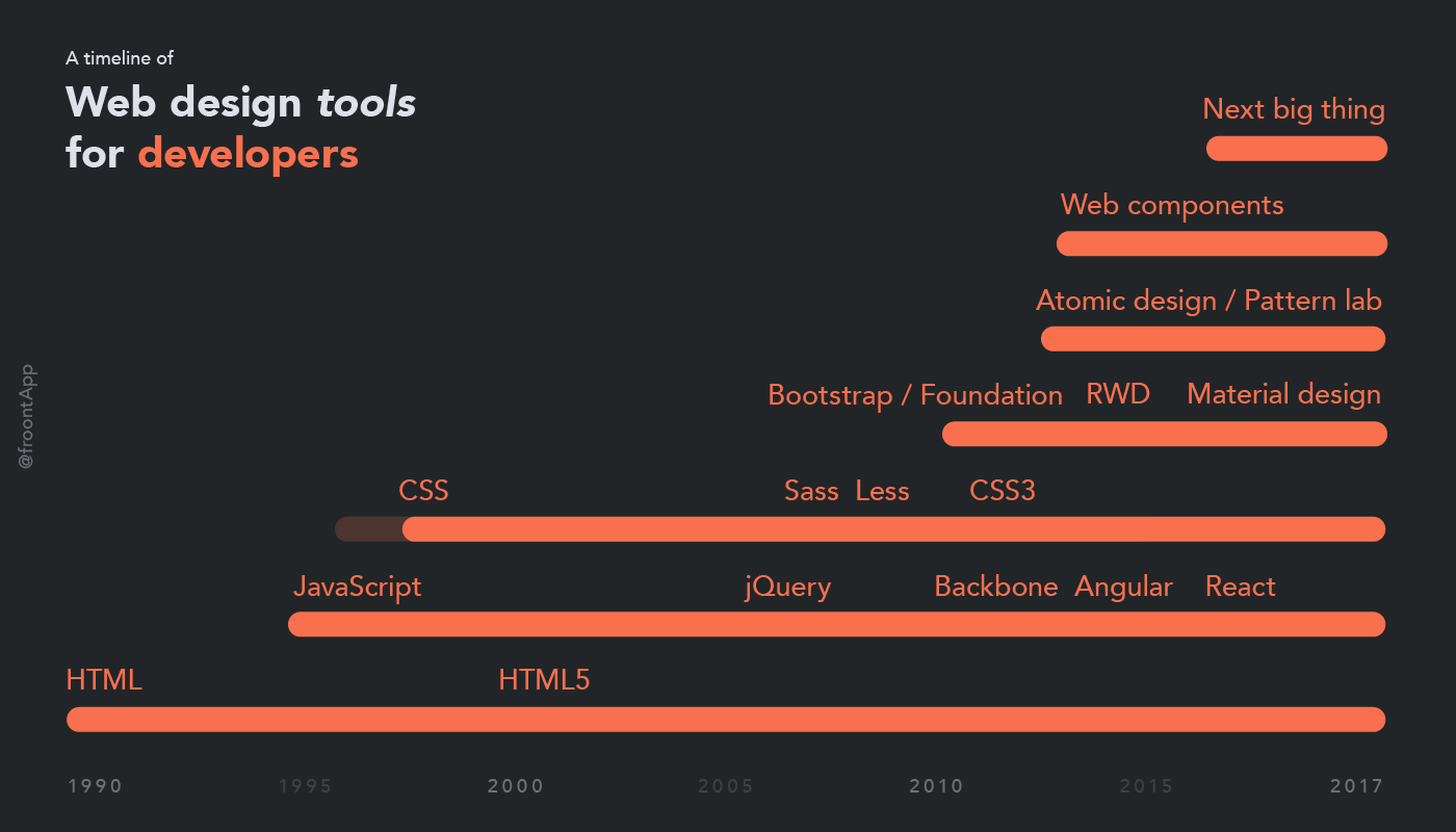
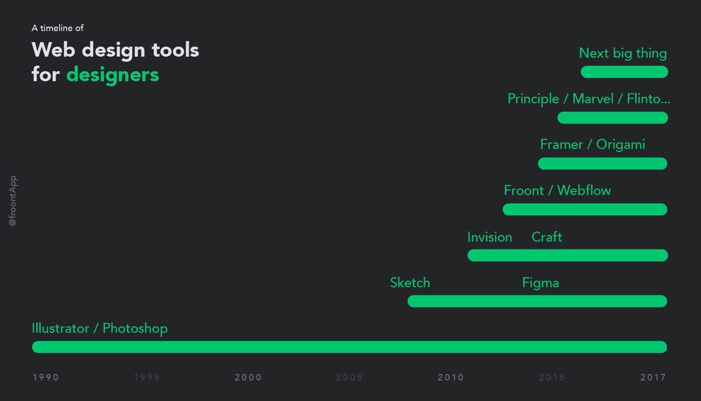
Historically, developers had more tools than designers. Most likely because they can build things for themselves, whereas fewer designers can do it alone.
Design space is getting serious
2016 started to show some signs that the whole design tool space is maturing. InVision acquired Macaw, then Silver Flows, then Easee, Muzli and some more. Marvel acquired Pop, Google acquired Pixate and announced new set of tools — Gallery and Stage. Figma is working on some interesting things while Adobe tries to catch up. I have a feeling that 2017 will be fascinating.
The winning approach to design
Once there was a hope that design and code will merge and designers will be able to deliver it all. Apparently, we aren’t there yet, and the rise of prototyping tools proves the point.
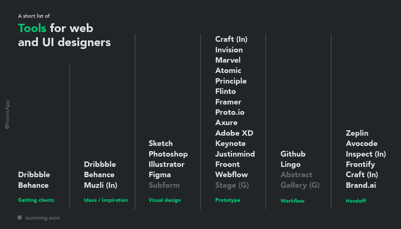
There is no shortage of prototyping tools. The reason seems obvious now — making sure the project works on all screens and devices isn’t easy. Designers don’t want to take the blame when something goes wrong and prefer clickable prototypes.
A better workflow
Now it’s pretty clear — there won’t be one tool that can solve all problems. It’s rather a set of tools that integrate with each other. The Sketch is the ultimate example of that. It creates a new challenge, though — how to organize everything into one workflow where teamwork, client feedback, design deliverables and future improvements work together. Developers were first at solving that again — version control like Github is the core of any serious development, yet for designers, even working as a team needs lots of tinkering. Tools have tried to solve that before and some are in the making.
Design with real data
Another hope that took off in 2016 is design with real data. That makes lots of sense (Thanks, Josh!) as it helps us make better decisions and find the edge cases before development starts. What seems most amazing here is that it looks like one blog post created this whole paradigm shift. Wish more people would write about better solutions!
Content is the king
Design for various devices and screen sizes has lots of limits regarding how far we can go with layouts. Content is the king again! That means more emphasis on written words, meaningful photography, illustration, and typography. That makes even more sense knowing that the content we create must be consistent and able to survive across web pages, apps, blogs, and social media.
What’s missing or a wish list for 2017
Sketch started as a better, more focused Photoshop for UIs. Figma works to become a better Sketch and Subform joins the game. The new ideas that prove themselves end up in other tools. In any case, that’s evolution. It’s easy to see what’s happening, but let’s look at what hasn’t happened at scale.
Our tools aren’t smart
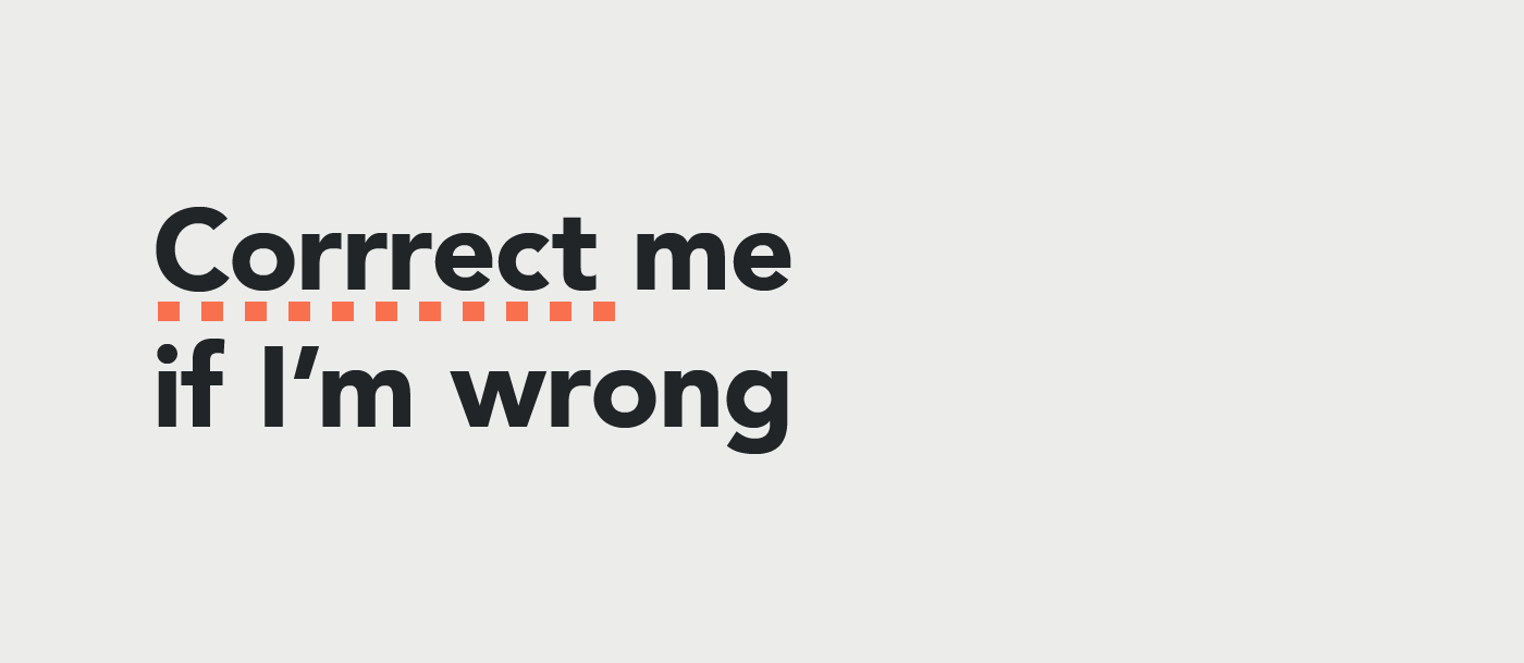 I wish more tools would guide us through the design process. Not only doing what we tell them to do, but notify us when we could improve. Or at least inform us of better options (improve accessibility, readability, basic design theory, etc.). Something like spelling suggestions or optical kerning but for design decisions. The same applies to smarter default values.
AI and machine learning
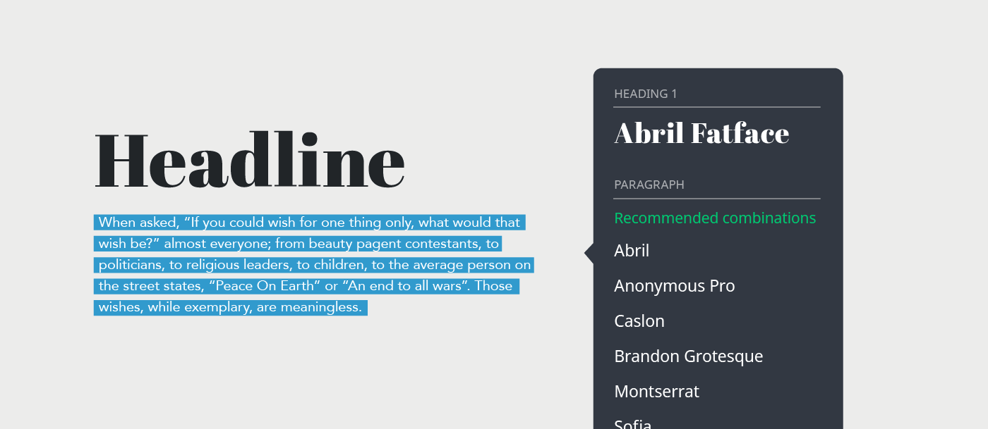 The design is a system, and humans aren’t great at seeing all possible options at once. We’re even less great at fixing problems we don’t see. If you ever wondered how an experienced designer could come to the solution faster than someone who is just starting, it’s because of experience, of course. A big part of this experience is about processing all the possible combinations, something that computers could help with.
Bringing atomic design principles to design practice
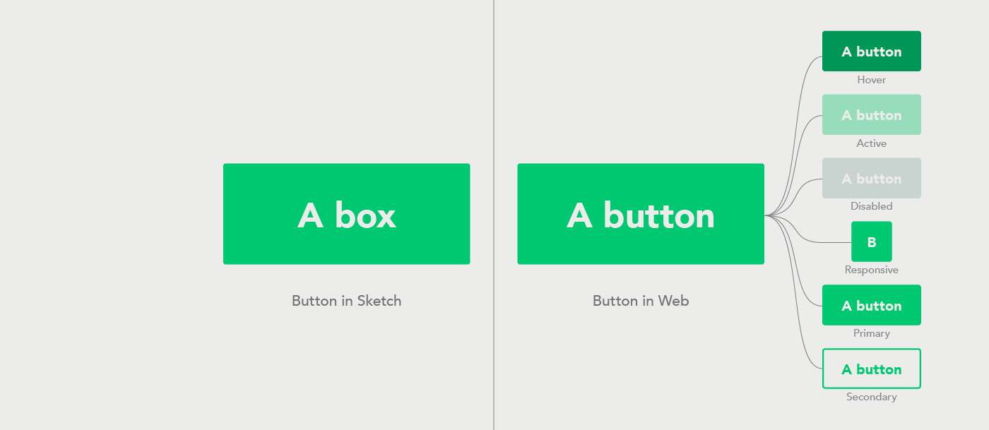 Currently our visual design tools have no clue about the context. We still draw boxes and pretend those are buttons. If there would be a way to merge atomic design principles with our design tools it would simplify a lot.
No matter how you look at the landscape of design tools one thing seems sure — there will be more of them, not less. Interactive design is evolving as we speak and new ways of using the web and apps bring new challenges.
If you feel that I overlooked your favorite tool, please add in the comments below.
