Understanding how positioning in the web works is crucial for responsive web design, as it allows us speak the same language with developers and helps make better design decisions. Compared to static design tools (Photoshop, Illustrator, Sketch) it's more complex as well, because the position depends on everything around it; scrolling, screen size and other factors.
To complicate things even more, different types of position in the web have names that are quite confusing – Static, Absolute, Relative and Fixed – where static isn’t really static and absolute depends on the placement. Therefore here is a short, visual manual of what is what.
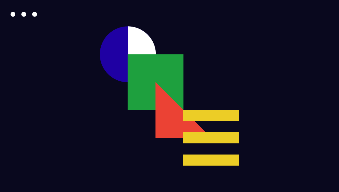
The Z-index
 Before we jump to positioning, lets explain what the Z-index is as it affects all types of positioning in some way. So Z-index is a simple way to tell which element is in front of another one, similar to layers in the static design apps.
DO: Use for buttons, clickable stuff.
DON'T: Avoid text being on top of that clickable stuff as it becomes unclickable...
Static position
 Static is the default positioning type. Although the name suggests that nothing is moving it isn’t the case. Static means elements are static to the flow – if one moves, another will move as well.
DO: Your safest bet it will scale on all browsers well. Adding Min and Max limits horizontally and vertically will help to keep the design perfect.
DON'T: Watch out for text blocks with changing content as it can break the design.
Absolute position
 Absolute positioning defines the element based on X and Y property. The tricky part is that it will be absolute to the parent element that has a position of Relative, Absolute or Fixed. If there are none, it will be absolute to the page. Absolutely positioned elements don’t care much about the flow, meaning they live in their own universe and aren’t affected by anything around them. It will appear on top of any static positioned element.
DO: A menu or logo that needs to be always on the top of the page? Go for it!
DON'T: Absolute and Responsive aren't best friends.
Relative position
 Relatively positioned elements behave exactly like static ones, but they serve as a local frame of reference for absolutely positioned child elements.
DO: Use on a parent container for absolute positioned elements.
DON'T: If a logo or a badge has to always sit on top of the screen, don't wrap them in a relative element.
Fixed position
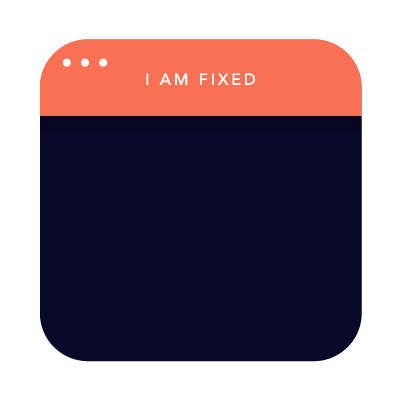 Fixed means the position will always be locked to the size of the browser's window (viewport).
DO: Navigation that is always visible on the top of the screen? Yes!
DON'T: If something is behind a fixed element it won’t be clickable.
Real life
In real life the type of position is often changed as we go and they are mixed together. For example if you want a banner be scrollable until it reaches the top, then at first it will be absolute, but then it will become fixed by adding some JavaScript.
These are the basics, but there is more. What if you want to align two elements side by side? This is where float properties, inline blocks and margins come into play (we'll explain about those soon). In FROONT we mainly combine static positioning with margins as it is easier to maintain the code later.